Translate

Saturday, December 1, 2012

Hard Work

Empathy is partly defined as the capacity to participate in an other's feelings.  An artist who can draw the figure convincingly and chooses the telling gesture, can help us empathize with his subjects, and create a memorable impression.  For some examples I have singled out Robert Gwathmey, an artist from North Carolina.  This work is titled "End of Day," and is self explanatory.  The viewer can poignantly "feel" the weight of the lumber because of the accuracy of the drawing of the foreground figure.  Note that the planks are sagging at the ends from their own weight and the man's right arm hangs wearily straight down, with a large heavy hand at the end of it, like a pendulum.


Another forceful piece of artistry is this painting titled "Hoeing."  Gwathmey felt that his paintings shouldn't need a lot of talking about; he was taciturn when it came to his own work.  The main figure in this next painting is so eloquent that no further commentary is necessary.


It is worthwhile to anyone interested in expressive drawing to study the work of Robert Gwathmey.


Monday, September 3, 2012

Soft Edges

Paintings with soft edges are fewer.  The fuzzy borders between forms often connote something seen through a haze of imperfect memory, or something nebulous in nature, such as smoke, fog, rain, spray or blowing snow.  Both of these could be the case with this picture of a storm at sea by Turner:


  Sometimes soft edges are used to indicate tenderness or innocence or femininity.  Those are the qualities effected by this Renoir painting:


In giving these rectangular shapes soft edges, Rothko possibly meant to guide the viewer away from giving the forms an identity, and focus the attention instead on the buzz produced by the colors; to encourage a state of non-specific contemplation.  It's only a guess; his intention could be something like that.


My readers and students, having had the concept indicated, can find other examples.  I put in this last one because it is really, really soft.  It was painted by Joseph Gies in 1898:


Sunday, August 26, 2012

Like The Rolling Stones

Many Americans go to Europe to study and are influenced in their work by the highly developed art they see there.  Most often the influence is subtle and becomes absorbed into the student's own ideas, techniques and approaches to work.

But others seem to have been so deeply affected that they continue to emulate their heroes in an obvious way into middle age and beyond.  I have picked on five artists who fit that category.

This first one is not by Manet, but by Gari Melchers, done when he was 40.


Degas?  Nay, Maurice Sterne, at age 46.


This "Renoir" was painted by William Glackens when he was about 55.


Not Gauguin in Detroit, John Wicker at age 64.


Dwight Tryon, still doing Monet at 72.


The most recent of these pictures was made around 1925, before the easy and widespread availability of color reproductions.  I suspect that many of these men sought to introduce the admirable, if sometimes undigested innovations from Paris into America, much like the Rolling Stones wanted to bring their beloved Chicago blues music to the UK.


Saturday, August 11, 2012

Hard Edges

Yet another of the options an artist has to choose from is the hard edge.  A painting with all or almost all hard edges between forms implies an unequivocal approach.  It signifies certitude and decisiveness.

Examples abound throughout history.  This section of a tomb painting from Egypt is about 3500 years old. 


This detail of a mural by Botticelli in the Sistine Chapel is 530 years old:


Here is a Japanese woodcut from maybe 150 years ago.  Note the use of contrapposto in this and the example above. http://williambuffett.blogspot.com/2012/07/contrapposto.html


The Stuart Davis is about 60 years old:


This painting by Leigh-Anne Eagerton is from this year:


Sunday, July 8, 2012

Contrapposto

Historically, contrapposto is a recently coined word (about 1903) but an ancient practice.  It is defined partly as: multiple figures which are in counter-pose (or opposite pose) to each other.  A fuller definition is suggested by a dictionary entry for counterpoint: combination of two or more melodies into a single harmonic texture in which each retains its linear character.  Substitute "figures" for "melodies."

Many fine compositions have been crafted with a judicious use of contrapposto.  My first example is a Greek sculpture from about 510 BC.  Luckily, hostile invaders from some other tribe only did a mediocre job of breaking up the sculpture.  A man has snatched a woman he wants off her feet and is getting ready to put her in his chariot.  She's not putting up a fight.


This Imperial Roman wall painting, preserved under a 75 foot layer of volcanic ash, is a copy of a Greek original.


About 1400 years after the eruption of Vesuvius, artists in Florence began to put contrapposto to use again.  This is by Leonardo da Vinci:


This is another very compact sketch - hand to hand combat this time.  Michelangelo, about 1520:


A stable and harmonious group by Rembrandt from about 1635.  Note the slight foreshortening of the seated man's right leg.


Here is an example of too much contrapposto.  Each figure is nicely posed, alive and articulated; there is no stiffness or inertness about any of them.  But together, they don't read.  What is the cause for all this dramatic gesturing?  Ranieri del Pace:


The last two are more recent examples - Degas, 1895, and N. C. Wyeth, 1916.


Saturday, June 23, 2012

Pierre Renoir

There is much to read about Pierre Renoir's beautiful surfaces and the luminosity and freshness of his oil paintings.  The soundness of his compositions, though, is sometimes overlooked, yet is fundamental to the appeal of his work.

I have set some of Renoir's compositions against those of three Renaissance masters.  I have stripped away the religious, mythical and historical elements and costumes in order to focus attention on the arrangement of the forms.  All the illustrations are reduced to line only, to make comparison clearer.

One of the great challenges in art is the composing of several figures, overlapping each other, full of variety and action, packed into a small space, yet retaining clarity and readability.  The first example is by Fra Bartolommeo and features three people lamenting the death of a fourth.


Michelangelo's contribution is a group of naughty boys getting into the wine supply.


From Raphael we have a teacher with some rapt students.


Renoir's theme in this comparison is a modern one: young adults enjoying some leisure time in a casual social setting.


It looks as though Renoir learned some lessons from the great Florentines.


Saturday, June 16, 2012

Cease Fire

In a previous post,  http://williambuffett.blogspot.com/2012/04/another-approach-to-color-harmony.html  I promised to publish the result of my stab at color harmony by means of the trial and error method.  At the time, the painting looked like this:


I wanted the picture flooded with sunshine; that meant a blue or bluish color for the sky and foliage of greens ranging from gray-blue green to bright, light lime.


With those relatively natural colors as a starting point, I had mostly to choose the hues to use on the building. Groping toward a harmonious choice, I tried yellow, orange, pink and various blues and greens.  I settled on violet by trial and error; violet felt best.

But in order to maintain a strong pattern of light and dark, the violet had to be almost white.  I tried to strengthen the violet by placing some (dull) yellow near it - the shutters and a flowering bush.


The thinking behind the evolution of this picture demonstrates the process of throwing the color scheme out of balance, then trying to restore harmony.  Back and forth until a cease-fire is achieved and terms of surrender are signed.  Peace.


Saturday, June 9, 2012

Artfulness in the Funny Papers

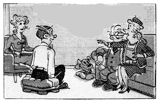
To illustrate the artistic skill which often goes into comic strips, I have chosen one example.  The artist Jim Raymond drew this strip.  I have removed the text bubbles to focus attention on his expressive and true-to-life drawing ability.  In this frame, the woman on the right has everyone's attention, including the dog's, and is making an important point.  We know that, because everyone's gesture tells us so.  Dagwood is sitting on a hassock, his back straight, his eyes wide, his mouth ajar and smiling, his hands almost gripping the upholstered seat.  With all eyes on her, the speaker is primarily addressing her hostess, Blondie.  With both hands animated, she is obviously excited and delighted about what she has to tell the others.  The composition of the whole frame, adjusted to accommodate a large dialog balloon, is clear as well as expressive.


The second drawing I chose to examine, graphically depicts the reactions to an alarming, loud noise.  The dog's smile has vanished and her head turns sharply toward the source of the noise.  The couple freezes as Dagwood jerks his head up, his mouth small and tight, and Blondie's hand goes to her heart.


The reader is not usually consciously aware of these refinements of drawing, but they go a long way to further the story.

It wouldn't be fair of me not to show the strip in its entirety.


Saturday, May 26, 2012

A Conceptual Artist (No Pictures)

I saw an item in a newspaper column entitled "News Of The Weird."  It read, in part: ...at the annual spring auction at Christie's in New York City, Massachusetts artist Tom Friedman managed to sell a piece consisting of an ink squiggle on a 12-by-18-inch piece of white paper (described in the Christie's catalog as "starting an old dry pen on a piece of paper").  It was sold for $26,000...

Not many artists get that kind of money; I looked up Tom Friedman.  He's not yet 50 and he has an impressive resume, including an MFA from the University of Illinois and exhibitions of his work in Chicago, New York, London, Rome, Stockholm, Geneva, Milan, Tokyo and many other cities.  Museums, too.

He transforms such ordinary materials as toothpicks, sugar cubes, plastic cups and bubble gum into intricate manifestations of his complex thoughts.

Sometimes the concept itself is the work of art.  Once he set up a pedestal and hired a witch doctor to put a curse on a spherical area of space above the pedestal.  The pedestal then became part of a sculpture exhibit, presumably with an accompanying printed explanation about the curse and all.


The paper with the pen squiggle surely came with some kind of affidavit, because if it couldn't be proven that it was done by a famous and accredited artist, it would have no importance beyond, say, a surface for 4 grocery lists.  It must have been bought as a more or less risky investment; it seems unlikely to enrich the decor of a room, or become an aesthetic marvel in an album of master drawings.  Its value would depend entirely on factors outside of itself.

Conceptual art is intended, above all, to make you think.  The wag who wrote this bumper sticker knew it:  IF YOU LIKE CONCEPTUAL ART THINK ABOUT HONKING


Saturday, May 19, 2012

Conceptual Art (No Pictures)

There is a droll quality hovering around conceptual art which I can't resist or dismiss.  I detect a tongue-in-cheek approach by the artists who practice it and I suspect they are proud of the fact that while the lay person regards it as a joke, the authorities treat it seriously - promote it, sponsor it, write about it, and buy it.  Conceptual art at its best is audaciously entertaining.

Here are a few examples of conceptual art:

One artist took a pencil drawing by another artist and erased it.  The result, a piece of white paper, was exhibited as a work of art, most likely with an explanatory caption, by the one who did the erasing.

An artist put up a barricade of oil drums, blocking a narrow street in Paris.  He declared that the resulting traffic jam was the work of art, not the oil drum barricade.

Another artist taped a piece of paper to his studio wall and claimed to have contemplated it and concentrated on it for a total of 1,000 hours over a period of years.  Then it was exhibited, with its explanation, as a work of art.

A Dutch artist, whose work was concerned with movement and measurements and walking, announced that his one man show consisted of all the shoe stores in Amsterdam.

A major British museum bought and showed a sculptor's work which was 120 paving bricks arranged in a rectangle on the floor.

These works of conceptual art and hundreds more like them have some things in common.  First, they were all created by brilliant, college-educated individuals who achieved wealth and solemn recognition from critics, dealers, other artists, museum curators, writers and art collectors worldwide.  Second, none of the pieces has to necessarily be seen to be appreciated; a written description is enough.  We know what a traffic jam, a shoe store,10 dozen bricks and a blank piece of paper look like.  A third thing they share is that they are all clever and original ideas which were written down, acted out or otherwise made concrete.  There are people and institutions willing to pay well for these original concepts; there is always a demand for the new and offbeat.

It seems easy - try it.  The best of conceptual art is very much like a stunt, meant to amuse, provoke, or otherwise entertain in order to promote the artist, the gallery or museum, and modern art in general.  Great skill and judgment is required to create an effective stunt.

A parallel exists in the advertising business.  The creative people who write, for instance, such simple phrases as these are well paid and much respected:

"Tide's in; dirt's out."  "Like a good neighbor, State Farm is there."  "When you're out of Schlitz, you're out of beer."  "Ban won't wear off - as the day wears on."

Many scoff at the slickness and gullibility of the highbrows who create or promote or pay for conceptual art.  I suggest looking at the phenomenon in a broader way.

This is one of my favorite original, creative ideas: I don't know who wrote it, but he stated that the answer to a particular challenge was "Kareem Abdul Jabbar."  The challenge was "Describe the sound of a fat lady taking off her girdle."

Sunday, April 29, 2012

Another Approach to Color Harmony

The only article I have published dealing with color harmony is "Don't Overlook Looney Tunes."  http://williambuffett.blogspot.com/2011/01/dont-overlook-looney-tunes.html  It suggests swiping color schemes from other artists.

 Another approach to color satisfaction is to put down experimental patches of color all around the surface and grope your way towards harmony.  It is best done with an opaque paint such as acrylics so you can cover sour notes.  For illustration, here is a picture I'm working on.  I have only a vague idea of the overall scheme, so am using the trial-and-error method.


Without being coaxed, I'll publish the finished painting when it has achieved Beautiful.


Saturday, April 21, 2012

Another Trick

When painting a light source, the brightest light an artist has is pure white pigment.  But an even brighter light can be implied. 

 An example from Rembrandt shows how.  In this painting, a detail of a picture illustrating a bible story, the woman is holding a candle - the main light source illuminating the painting - but it is hidden behind her hand.  Touches of pure white paint are applied near the source of light, thus implying that the candle flame is even brighter.


I applied this lesson to a painting I am currently working on.  The reflection of the sun on the water is pure white paint, implying that the sun, beyond the edge of the picture, is brighter than its reflection.


Try it sometime.

Sunday, April 15, 2012

White-Itis

Another pitfall for an artist to be wary of is "white-itis."  It is caused by adding white to a local color to represent the lit portion of a painted object.  It imparts an unpleasant chalky look to the picture.

One example of how not to model a colored object will be enough. The radishes in this detail of a still life are convincingly painted; the strongest color is where it should be, that is, where the light is strongest.  The highlight is white, indicating a glossy texture.


This, however, is a case of "white-itis:"

Sunday, March 25, 2012

Travel

This was not a "Sketching Trip."  I brought a little blank book along, for taking down notes and observations, and occasionally made a drawing.
In railroad stations there is a lot of this:


In the streets, there are plenty of these:


In the joints you see this:


Out your window you get something like these:


There are lots of roons:


Plenty of frugal meals:


I drew Big Joe Williams from Crawford, Mississippi in the same hall where Beethoven premiered many of his works.


This is my favorite from this trip.  An artistic type in a cafe:


This was not a "Sketching Trip."  I came to study the nuts and bolts of art at the Rijksmuseum, Louvre, Jue de Paume, National Gallery, British Museum, Tate, Courtauld, Prado, Ufizzi, Academia, Pitti, Duomo, Barghello, Casa Buonarroti, Vatican, Capitoline, Brera, Kunsthistorisches, Pinakothek and others.