Translate

Saturday, June 23, 2012

Pierre Renoir

There is much to read about Pierre Renoir's beautiful surfaces and the luminosity and freshness of his oil paintings.  The soundness of his compositions, though, is sometimes overlooked, yet is fundamental to the appeal of his work.

I have set some of Renoir's compositions against those of three Renaissance masters.  I have stripped away the religious, mythical and historical elements and costumes in order to focus attention on the arrangement of the forms.  All the illustrations are reduced to line only, to make comparison clearer.

One of the great challenges in art is the composing of several figures, overlapping each other, full of variety and action, packed into a small space, yet retaining clarity and readability.  The first example is by Fra Bartolommeo and features three people lamenting the death of a fourth.


Michelangelo's contribution is a group of naughty boys getting into the wine supply.


From Raphael we have a teacher with some rapt students.


Renoir's theme in this comparison is a modern one: young adults enjoying some leisure time in a casual social setting.


It looks as though Renoir learned some lessons from the great Florentines.


Saturday, June 16, 2012

Cease Fire

In a previous post,  http://williambuffett.blogspot.com/2012/04/another-approach-to-color-harmony.html  I promised to publish the result of my stab at color harmony by means of the trial and error method.  At the time, the painting looked like this:


I wanted the picture flooded with sunshine; that meant a blue or bluish color for the sky and foliage of greens ranging from gray-blue green to bright, light lime.


With those relatively natural colors as a starting point, I had mostly to choose the hues to use on the building. Groping toward a harmonious choice, I tried yellow, orange, pink and various blues and greens.  I settled on violet by trial and error; violet felt best.

But in order to maintain a strong pattern of light and dark, the violet had to be almost white.  I tried to strengthen the violet by placing some (dull) yellow near it - the shutters and a flowering bush.


The thinking behind the evolution of this picture demonstrates the process of throwing the color scheme out of balance, then trying to restore harmony.  Back and forth until a cease-fire is achieved and terms of surrender are signed.  Peace.


Saturday, June 9, 2012

Artfulness in the Funny Papers

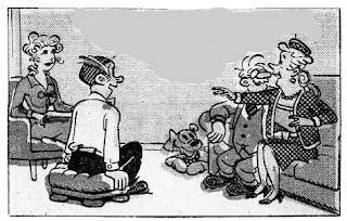
To illustrate the artistic skill which often goes into comic strips, I have chosen one example.  The artist Jim Raymond drew this strip.  I have removed the text bubbles to focus attention on his expressive and true-to-life drawing ability.  In this frame, the woman on the right has everyone's attention, including the dog's, and is making an important point.  We know that, because everyone's gesture tells us so.  Dagwood is sitting on a hassock, his back straight, his eyes wide, his mouth ajar and smiling, his hands almost gripping the upholstered seat.  With all eyes on her, the speaker is primarily addressing her hostess, Blondie.  With both hands animated, she is obviously excited and delighted about what she has to tell the others.  The composition of the whole frame, adjusted to accommodate a large dialog balloon, is clear as well as expressive.


The second drawing I chose to examine, graphically depicts the reactions to an alarming, loud noise.  The dog's smile has vanished and her head turns sharply toward the source of the noise.  The couple freezes as Dagwood jerks his head up, his mouth small and tight, and Blondie's hand goes to her heart.


The reader is not usually consciously aware of these refinements of drawing, but they go a long way to further the story.

It wouldn't be fair of me not to show the strip in its entirety.